Confirm

LED Displays for Luxury Retail: Design Considerations and Pitfalls

21.03.2026

In luxury retail, LED is not just display technology. It is part of the brand environment. That changes the standard completely. In a premium store, customers do not judge the screen in isolation. They judge how it feels within the architecture, the merchandise presentation, the lighting, and the overall tone of the space. A technically advanced display can still damage brand perception if it feels loud, poorly integrated, or visually disconnected from the retail experience. That is why execution matters more than technology alone.

This is also where many projects go wrong. Teams focus on brightness, size, and visual effect, but spend too little time defining the display’s role in the store. In luxury settings, LED should support atmosphere, storytelling, and product framing without overwhelming them.

Research from Nielsen Norman Group on cognitive load is useful here because it shows how visual clutter increases mental effort and weakens user experience. In a luxury environment, that principle applies physically as well as digitally: when the visual field becomes too busy, the brand loses clarity and the product loses focus. X-Rite’s guidance on color management is equally relevant, because premium retail depends heavily on accurate and consistent brand color reproduction across materials and display surfaces. Nielsen Norman Group’s guidance on reducing cognitive load reinforce the same point: clarity and control matter.
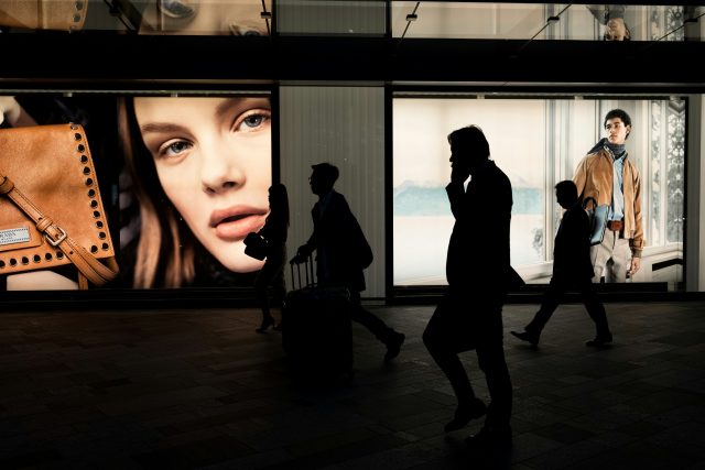
Infiled

Photo Credit © Simon

Why Luxury Retail Uses LED Differently

Luxury retail uses LED differently because the display is not there simply to attract attention. In mass retail, visibility and promotional energy are often the goal. In luxury, the goal is more selective. The display should deepen the environment, support storytelling, and elevate perception without making the store feel aggressive or transactional. That requires a very different design mindset.

A luxury boutique or flagship store typically relies on restraint, material quality, lighting nuance, and carefully controlled visual hierarchy. The LED display has to work inside that language. If it dominates the room, cycles through overly promotional content, or feels disconnected from the physical store design, it can lower the perceived value of the environment. NN/g’s work on visual clutter and change blindness is relevant here because both show that excessive or poorly prioritized visual elements reduce clarity and can make important elements less noticeable rather than more effective.

That is why luxury retail buyers should evaluate LED as part of the brand system, not just as a digital surface. The right question is not “How impressive is the screen?” but “Does the screen strengthen the store experience?” Sometimes that means a dramatic architectural feature. In other cases, it means a subtle integrated surface that almost disappears until the content activates it. INFiLED is most relevant in this conversation when the focus stays on design fit, image control, and environmental harmony rather than display spectacle for its own sake.

Integrating LED Seamlessly into Store Design

In luxury retail, seamless integration is often the difference between premium and disruptive. The display should feel intentional within the space, with proportions, finishes, placement, and content behavior that align with the store’s architecture. If the screen appears bolted on late in the project, or if the surrounding detailing is weak, customers notice the disconnect immediately.

This is why LED planning should begin early with architects, retail designers, lighting designers, and brand teams, like how we did in the Lancôme project with our partner Digitalli. During the process, our team visited the store with our system integrator partner and offered expert drawing adjustments to fit the store’s unique architect design, and provided technical insights to optimize display performance in the store.

The display affects sightlines, surface materials, reflections, ambient light balance, and the visual hierarchy of the store. It should not be treated as a standalone AV decision. Even where the screen is designed to be a focal point, it still needs to relate to the broader design language of the store. That includes bezel treatment, flushness, framing, integration with fixtures, and what the screen looks like when it is idle or displaying restrained content.

Placement is especially important. A luxury store display can act as a backdrop, a storytelling surface, a window-facing attraction, or a focal feature within a specific zone. But not every zone benefits from the same kind of digital presence. A display near hero products, private client areas, or fine materials needs a different behavioral logic than one in a façade-facing entrance zone. The more premium the environment, the less forgiving it is of generic placement decisions.

A good rule is that the architecture should remain legible whether the screen is on or off. If the store only “works” when the LED is active, the integration is probably too dependent on technology. Luxury environments should feel coherent first and enhanced second.

Color Accuracy and Brand Representation

Color accuracy matters more in luxury retail than many teams initially expect. In a premium environment, the display is not only showing content. It is representing the brand’s visual identity and sitting alongside highly controlled physical materials such as textiles, leather, metal finishes, packaging, and product colors. If the screen renders brand tones inaccurately, oversaturates campaign imagery, or shifts white balance relative to the store environment, the result can feel cheap even when the hardware is high-end.

X-Rite’s guidance on color management explains why calibration and profiling are essential for maintaining accurate color across devices and outputs. It also emphasizes that color consistency depends on standards and controlled workflows, not guesswork. That logic applies directly to retail LED. A luxury brand should not rely on approximate visual matching when campaign colors, skin tones, product finishes, and seasonal creative all need to feel consistent across physical and digital environments.

This becomes especially important when the store carries fashion, jewelry, cosmetics, or other products where perceived color influences trust and desirability. If digital content presents a product tone differently from the physical product nearby, the display may undermine rather than support merchandising. Likewise, if brand signature colors appear unstable from one store to another, the global retail experience becomes less coherent.

For that reason, luxury retail LED projects should include color standards, calibration practices, and review processes as part of the implementation plan. Brand alignment is not only about logo placement or campaign imagery. It is about ensuring that the display behaves like a controlled brand surface. 

Avoiding Overexposure and Visual Noise

One of the most common mistakes in luxury retail LED installations is overexposure. This can take several forms: excessive brightness, too much motion, too many simultaneous messages, content that changes too frequently, or screen placement that competes with product presentation instead of supporting it. The result is often the opposite of luxury. Rather than feeling immersive and premium, the environment starts to feel restless and overstimulated.

NN/g’s work on cognitive load is useful because it makes clear that clutter and unnecessary visual activity consume attention without improving understanding. In a luxury store, that cost is even more significant because attention should be directed toward products, materials, and carefully choreographed brand moments. If the display keeps demanding attention for its own sake, it breaks the rhythm of the space.

This is also why brightness has to be handled carefully. A very bright LED surface may be technically impressive, but if it overpowers soft lighting, reflective finishes, or intimate retail zones, it changes the emotional register of the store. Luxury environments usually depend on control, not maximum output. The display should be calibrated to the architectural lighting and intended mood, with dayparting or content presets where needed.

Motion design matters just as much as brightness. Slow, deliberate content often performs better in luxury than constant transitions or high-energy loops. Customers should feel that the display is part of the environment, not an interruption inside it. In many cases, one strong visual narrative or a restrained cinematic loop does more for premium perception than a dense sequence of campaign assets.

Common Mistakes in Retail LED Installations

A common mistake is treating the screen as a prestige object rather than a brand tool. This often leads to oversized installations that dominate the store but add little strategic value. Another mistake is poor architectural integration, where the LED surface looks appended rather than embedded. In luxury retail, that detail is highly visible because customers are already primed to notice finish quality and design coherence.

Another frequent problem is weak color governance. Teams may approve content visually without establishing calibration standards, leading to inconsistent brand tones between stores or between campaigns. X-Rite’s color-management guidance makes clear that consistency requires defined standards and controlled workflows, not one-off visual approval.

There is also a content mistake that shows up repeatedly: too much information. A luxury store display should not behave like a promotions board. When screens try to carry multiple messages, frequent transitions, or heavy text overlays, they add noise rather than value. NN/g’s research on clutter and change blindness is relevant here because overloaded visual fields make it harder for viewers to notice what actually matters.

Finally, some retailers underestimate what the screen looks like when inactive or between content states. In a premium store, the display has to belong to the environment at all times, not only during playback. Off-state appearance, reflectivity, black-level perception, edge treatment, and surrounding materials all affect whether the installation feels truly premium.

Design Best Practices for Premium Environments

The strongest luxury retail LED projects usually follow a few consistent principles. First, they define a clear role for the display. It should either support storytelling, frame product zones, shape atmosphere, or act as a controlled focal point. It should not try to do all of those things at once.

Second, they integrate early. The screen should be designed with the space, not inserted into it afterward. That includes architecture, lighting, materials, merchandising, and content planning. Third, they prioritize calibrated color and image discipline. Brand representation in luxury retail is too sensitive to rely on approximate output. Fourth, they use restraint. Minimal content, controlled motion, and balanced brightness often create a more premium result than maximum visual energy.

Finally, they judge success by brand perception rather than by technology metrics alone. The question is not whether the LED wall is powerful. The question is whether it makes the environment feel more refined, more intentional, and more aligned with the brand world the retailer is trying to create.

LED can be a powerful design element in luxury retail, but only when it is executed with discipline. In these environments, poor integration damages brand perception faster than weak hardware specifications ever will. The best installations are the ones that feel native to the space, represent brand color accurately, avoid unnecessary visual noise, and support the retail experience with confidence and restraint. That is what turns LED from a digital feature into a premium design asset. 

User registration
Join us to download our content. It only takes a moment!

    I have read and accept the privacy policy

    This site is protected by reCAPTCHA and Google.

    It looks like you are visiting the website from
    Select your region: