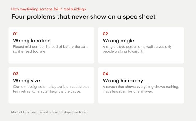
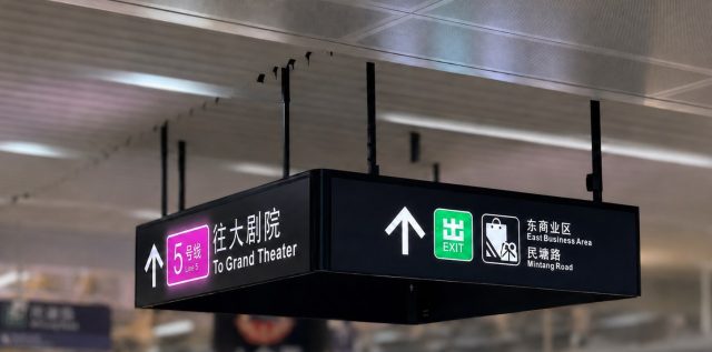
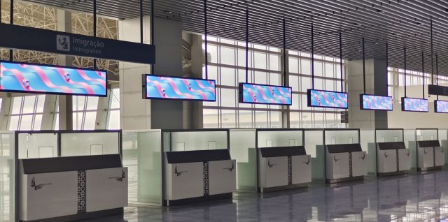
Most guides to digital wayfinding are written by software and kiosk vendors, so they focus on maps, apps and analytics. Those matter, but they skip the part that decides whether people actually notice the screen: where it hangs, which way it faces, how tall the characters are and what it says at the moment a traveller has to choose a direction.
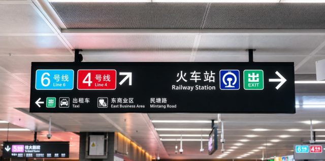
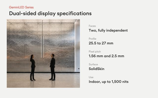
A common mistake is treating a wayfinding display like a digital poster. A poster is put where there is wall space. A wayfinding display has to sit where a decision is made, in the sightline of the people making it, and in busy corridors that means people arriving from both directions. This article covers the design logic behind digital wayfinding for airports, transit hubs and malls, and why two-way foot traffic changes the hardware you need.